The Heart Behind Our New Visual Identity
Our Journey Toward Clarity
In 2024, we realized that our digital presence and visual identity had become fragmented. With more than thirteen ministry brands operating independently, it was becoming difficult for newcomers to navigate our community, and our online space did not fully reflect the vibrant life of our church.
Following Jesus’ example of communicating intentionally in the language of His time, we felt called to refresh our brand. Our goal was simple: to ensure Christ’s message remains deeply accessible and resonant within today’s cultural landscape.
To bring this vision to life, we partnered with the creative agency Colours & Shapes, alongside award-winning graphic designer Jeremy Kang. Together, we developed a cohesive brand architecture designed to speak clearly to every generation in our diverse Surrey neighbourhood—from our youngest children to our cherished seniors.
This journey culminated in December 2025 with the launch of a unified visual identity and two custom-designed websites. Whether someone connects with us online or walks through our doors in person, they are now met with a consistent, warm, and Christ-centred welcome.
Windows, Doors, and Stories
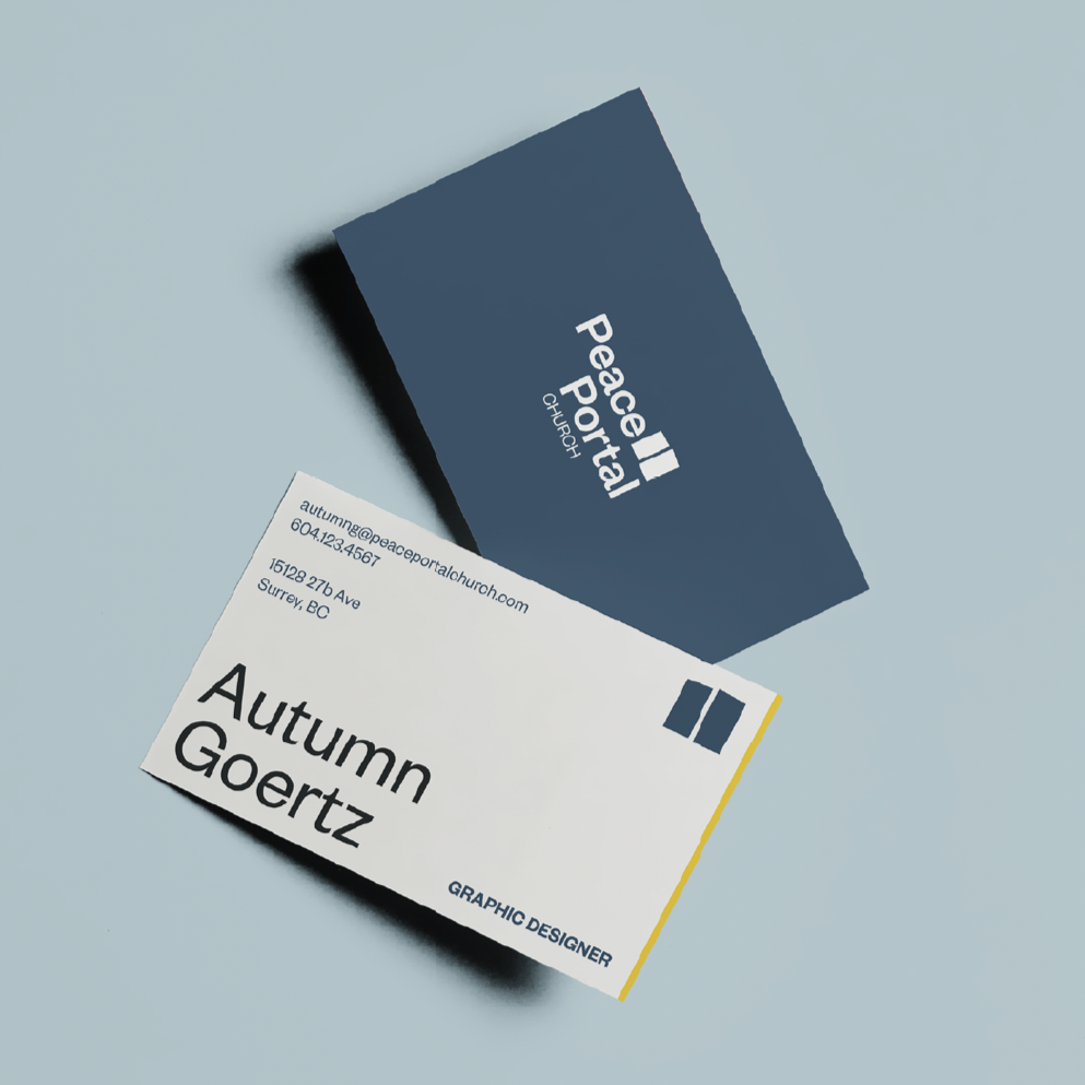
Our new logo visually expresses our vision: Growing Disciples, Serving Neighbours, and Sharing Christ. Built around a "windows and doors" framework, the icon carries three layers of meaning:
Windows & Doors — An open invitation: welcoming the community in (sharing/growing) and sending the church out (sharing/serving).
The Unfolding Story — Abstract pages opening, inviting everyone to find their place in God's larger story (sharing/growing).
The Broken Grid — A balanced yet open composition, reflecting that our work is ongoing and ever-evolving (growing).
Brand Typography
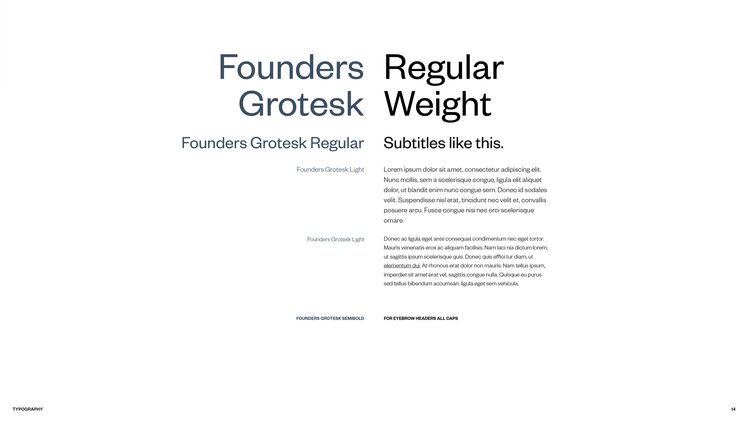
Our primary typeface, Founders Grotesk, brings a modern and approachable voice to the brand. This sans-serif font balances excellence with warmth through its distinctive mix of sharp edges and rounded details.
Fonts & Colours
Each ministry expresses its own character through a unique header font and colour palette, while sharing the same body font as the parent brand. This creates a clear "family" feel — each ministry is distinct, yet part of one church.
Need our media & brand assets?
We'd love to share our story with you. If you need our logo or other visual materials for a partnership or media feature, please email to our communications director, youngtaec@peaceportalchurch.com